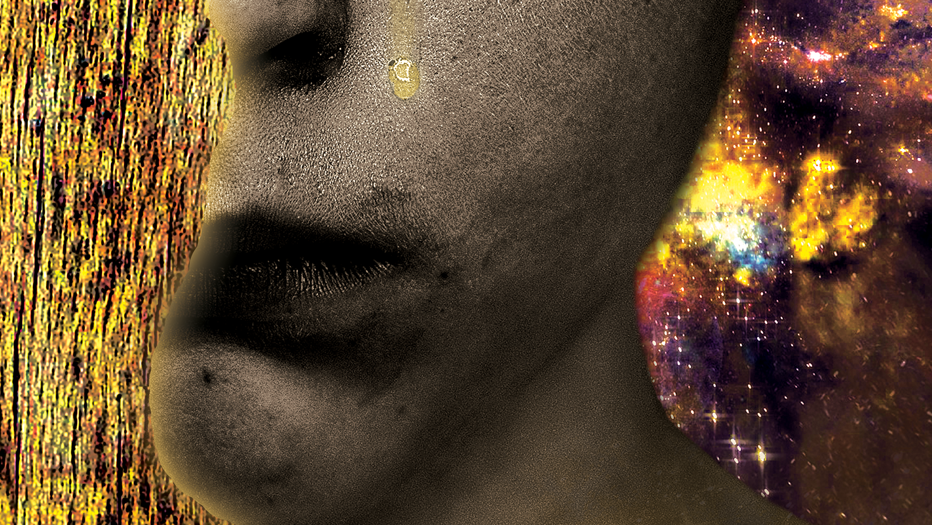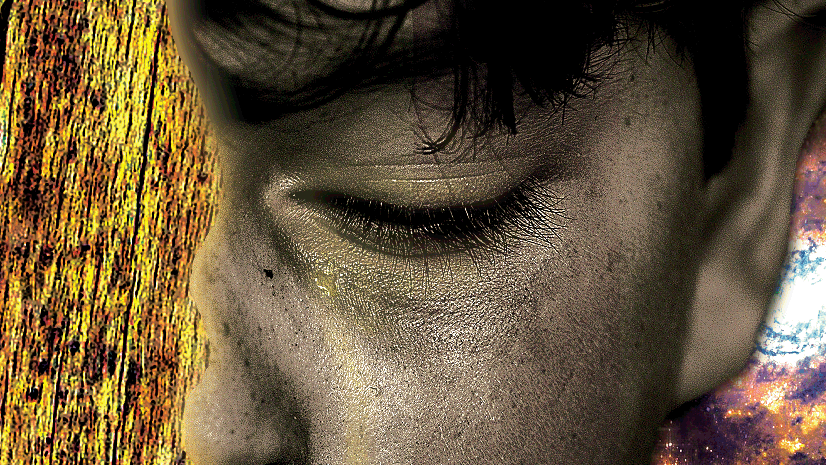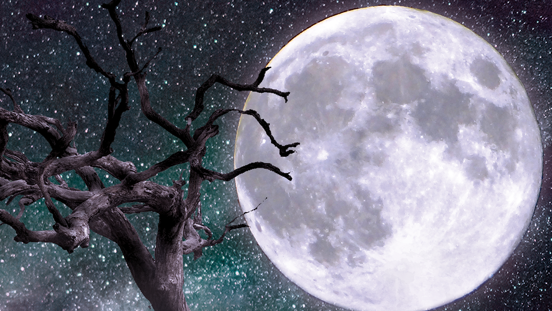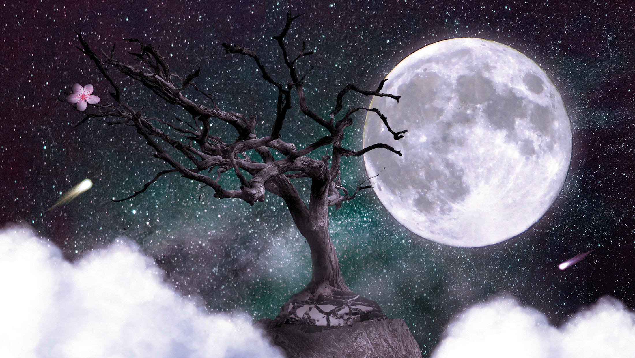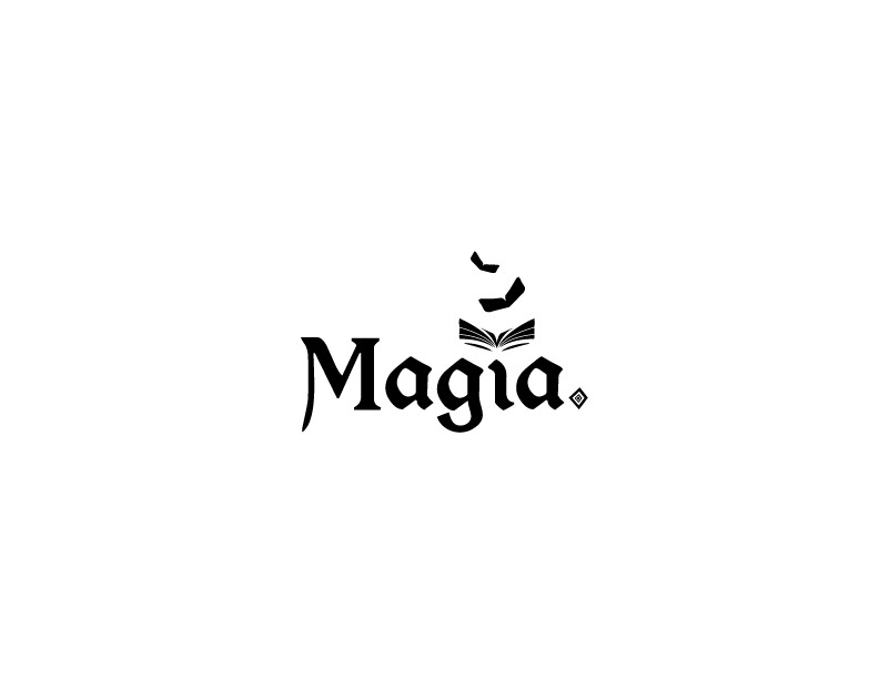

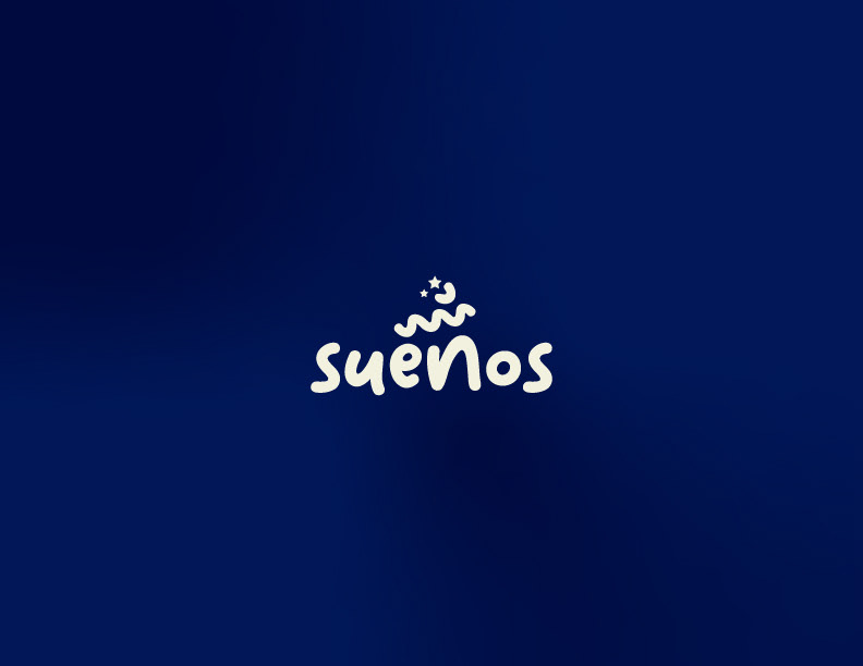

In this project, we were given two Spanish words, Magia (Magic) and Espacio (Space), and we could freely choose the third one, Sueños (Dreams). The main objective was to design a logo using only the chosen typeface. In the case of Magia, I used a Gothic style family font named Morris Roman and altered the accent mark of the letter " í " so it look both a spell book and butterflies or something with wings, sending the clear message of magic and illusion. For Espacio, I used a family font named Nasalization and rounded the corners for a cleaner and futuristic look. Also, I added kerning to emphasize the other definition for space and a little star for transmitting the galactic vibe. For Sueños, I used Pulang as font family and altered the " ñ " accent mark so it looks like a cloud and added stars and a moon to complete the concept.